The Racing Bar Chart Visualization Plugin For MicroStrategy
Did you know that there are lots of additional visualization plugins available for MicroStrategy that do not come pre-installed with the product? The Racing Bar Chart (by Dong-Hyub Lee) is one of these “add-ons'” that can add even more value to your Dossier Storytelling. I’ll write more about how to install and configure this and the other plug-ins in a future post.
In my example video, I used the Racing Bar Chart as it’s quite good at showing the progression of COVID19 in the US.
Once the animation “settles down”, you can see definite patterns as to which states have COVID19 under control and which do not. It’s quite interesting (and disturbing) to see how New York State was hit hardest early on, but managed to stabilize the outbreak. While on the other hand, you can see an obvious massive surge in states like Florida, Texas, Arizona & California about a week or two after each of the recent major holidays (Memorial Day, End of May and Independence Day, July 4th).
I plan on updating this video over the coming months to see how everything is progressing / deteriorating.
So, how do you use the Racing Bar Chart?
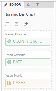
Once installed and available in your visualization panel, add it to your canvas and start configuring it. This particular visualization requires just three pieces of information in order to function…
- An Attribute. In my example, I am using STATE
- A Time Attribute. I am using DAY / DATE
- A Metric. I am using Daily COVID19 CASES
Once you have added your three data points, a PLAY timeline bar will automatically be displayed at the bottom of the viz (see my example). Just hit PLAY and watch your bars animate. Magic. There are additional formatting options available in the Format Panel. However, because it isn’t part of the official MicroStrategy product, the level of customization is restricted to what the plug-in allows.
Stay tuned for more details on this and other plug-in for MicroStrategy.
